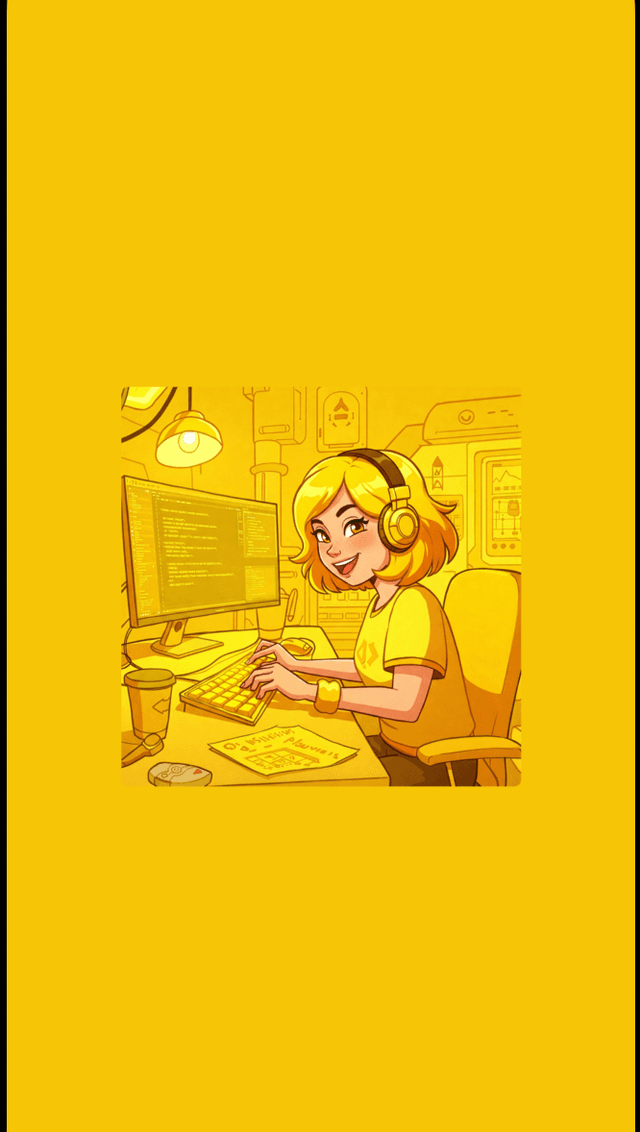
Spotify inspired dominant color gradient tutorial in React Native app
This tutorial assumes you have an Expo app set up. If not, please refer to my previous post on how to set up a React Native app with Expo and TypeScript.
The complete code for this tutorial is available on GitHub
Extract dominant color from image
In this tutorial, we will use react-native-image-colors to extract the dominant color from images. Since setting up this library can be challenging, I'll guide you through my troubleshooting experience.
First, write a custom hook that will take an image source as an input and compute the dominant color of that image. Let's call it useDominantColor. In the hook file (e.g., useDominantColor.ts), import:
Step 1: Install the package:
npm i react-native-image-colorsStep 2: Import the required modules
import React from "react";
import { Platform } from "react-native";
import { getColors } from "react-native-image-colors";
import {
  AndroidImageColors,
  IOSImageColors,
} from "react-native-image-colors/build/types";
Step 3: Create the hook
Notice that for Android we are using the dominant color and for iOS we are using the primary color. This is because the library returns different color properties for Android and iOS. A full list of properties can be found in the documentation.
export const useDominantColor = ({ imageUrl }: { imageUrl: string }) => {
  const [color, setColor] = React.useState<string | null>(null);

  React.useEffect(() => {
    const fetchColor = async () => {
      try {
        const colors = await getColors(imageUrl, {
          fallback: "#31014B", // any fallback color
          cache: true,
          key: imageUrl,
        });

        const extractedColor =
          Platform.OS === "ios"
            ? (colors as IOSImageColors).primary
            : (colors as AndroidImageColors).dominant;

        setColor(extractedColor);
      } catch (error) {
        console.error("Error fetching colors:", error);
      }
    };

    if (imageUrl) {
      fetchColor();
    }
  }, [imageUrl]);

  return { color };
};
The hook consists of three main parts:
- State management using the
useStatehook - Color fetching logic in the
useEffecthook that runs on mount or whenimageUrlchanges - The
getColorsfunction that extracts the dominant color from the image
Step 4: Use the hook in your component
Import and use the useDominantColor hook in your component:
import { useDominantColor } from "@/hooks/useDominantColor";
import { Image, View } from "react-native";

export default function GradientScreen() {
  const image = require("@/assets/images/GGIY.jpg");

  const { color } = useImageColors({
    imageUrl: image,
  });

  return (
    <View
      style={{
        height: "100%",
        width: "100%",
        justifyContent: "center",
        alignItems: "center",
        backgroundColor: color || "#FFFFFF",
      }}
    >
      <Image source={image} style={{ width: 250, height: 250 }} />
    </View>
  );
}
Troubleshooting
If you encounter issues with the getColors function, here are some common problems and solutions:
- Error: "Cannot find native module 'ImageColors'": run
npx install-expo-modules@latestto install Expo modules. Runnpx expo prebuildto generate the native code. That should resolve the error. - Error: Can't see the result in the Expo app: Make sure to run the app on a physical device or an emulator. Sometimes, the Expo Go app may not support certain features of the library.
- Error: "Cannot read property 'dominant' of undefined": This usually means that the image URL is not valid or the image cannot be loaded. Make sure the image path is correct and accessible.
- Error: "getColors is not a function": Ensure that you have installed the
react-native-image-colorspackage correctly and that you are importing it from the right path.
Create a gradient background
Now that we have our color extraction working, let's create a gradient background component.
Step 1: Install the react-native-linear-gradient package:
npm i react-native-linear-gradientStep 2: Apply the LinearGradient component to the background of your screen:
import { useImageColors } from "@/hooks/useGetColors";
import { Image, View } from "react-native";
import LinearGradient from "react-native-linear-gradient";

export default function GradientScreen() {
  const image = require("@/assets/images/GGIY.jpg");

  const { color } = useImageColors({
    imageUrl: image,
  });

  return (
    <View
      style={{
        height: "100%",
        width: "100%",
        justifyContent: "center",
        alignItems: "center",
        backgroundColor: color || "#FFFFFF",
      }}
    >
      <LinearGradient
        colors={[
          "rgba(0, 0, 0, 0.0)",
          "rgba(0, 0, 0, 0.8)",
          "rgba(0, 0, 0, 1)",
        ]}
        style={{
          height: "100%",
          width: "100%",
          position: "absolute",
          left: 0,
          right: 0,
          bottom: 0,
        }}
      />
      <Image
        source={image}
        style={{ width: 250, height: 250, borderRadius: 4 }}
      />
    </View>
  );
}- The gradient is positioned absolutely to cover the entire screen, before the
Imagecomponent to place it behind. - Add
borderRadiusfor rounded corners.

Add shadow to the image tile
To make the image stand out more, let's add a subtle shadow effect.
<Image
  source={image}
  style={[
    {
      width: 250,
      height: 250,
      borderRadius: 4,
    },
    {
      shadowOffset: {
        width: 0,
        height: -4,
      },
      shadowOpacity: 0.15,
      shadowRadius: 3,
      shadowColor: "black",
    },
  ]}
/>
Animation on scroll
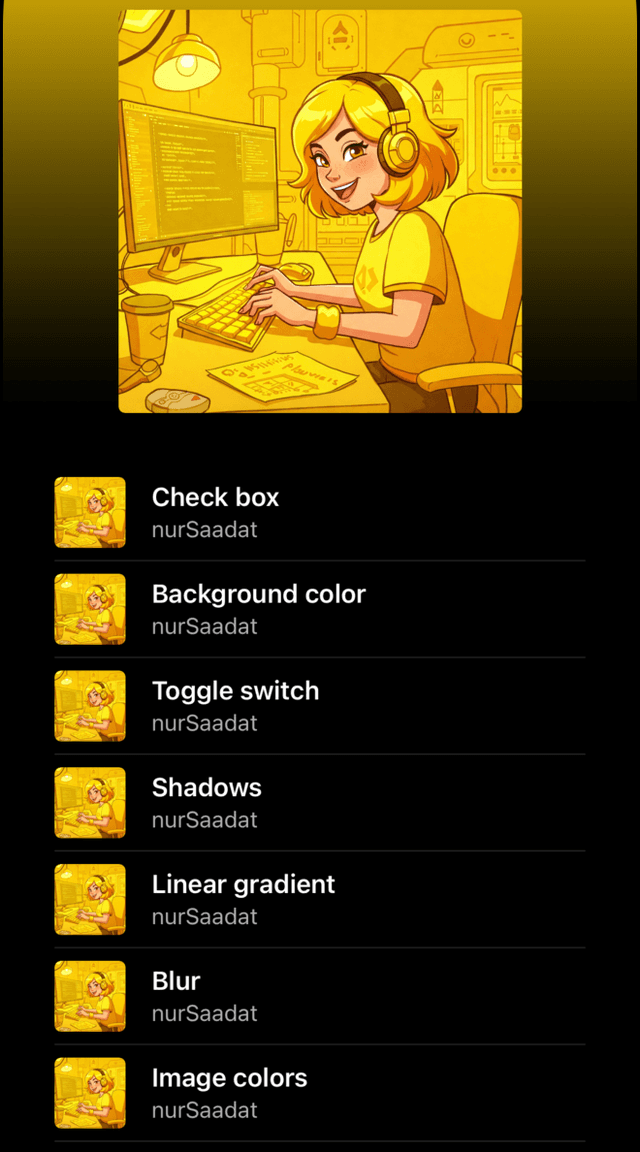
Let's enhance our UI by adding a scrollable list of items, similar to a Spotify album page. We'll use a scroll view and map through our data (a static array of songs) to create list items.
  const album = [
    { author: "nurSaadat", title: "Check box" },
    { author: "nurSaadat", title: "Background color" },
    { author: "nurSaadat", title: "Toggle switch" },
    // More items...
  ];

export default function GradientScreen() {
  ...

  return (
    <View
      style={{
        height: "100%",
        width: "100%",
        backgroundColor: color || "#FFFFFF",
      }}
    >
      <ScrollView>
        <LinearGradient
          colors={[
            "rgba(0, 0, 0, 0.0)",
            "rgba(0, 0, 0, 0.8)",
            "rgba(0, 0, 0, 1)",
          ]}
          style={{
            width: "100%",
            left: 0,
            right: 0,
            bottom: 0,
          }}
        >
          <View
            style={[{
                height: HEADER_HEIGHT + top,
                overflow: "hidden",
                alignItems: "center",
                paddingTop: top,
              }]}>
            <Image
              source={image}
              // other params ...
            />
          </View>
        </LinearGradient>
        <View
          style={{ padding: 32, overflow: "hidden", backgroundColor: "#000" }}
        >
          {album.map((item, index) => (
            <View
              key={`item-${index}`}
              style={{
                height: 60,
                backgroundColor: "#000",
                width: "100%",
                alignItems: "center",
                borderBottomWidth: 1,
                borderBottomColor: "#1f1f1f",
                flexDirection: "row",
                gap: 16,
              }}
            >
              <Image
                source={image}
                style={[
                  {
                    width: 44,
                    height: 44,
                    borderRadius: 4,
                    shadowColor: "black",
                  },
                  {
                    shadowOffset: {
                      width: 0,
                      height: -4,
                    },
                    shadowOpacity: 0.15,
                    shadowRadius: 3,
                  },
                ]}
              />
              <View
                style={{
                  flex: 1,
                  justifyContent: "center",
                  gap: 2,
                }}
              >
                <Text
                  style={{ color: "#fff", fontSize: 16, fontWeight: "600" }}
                >
                  {item.title}
                </Text>
                <Text style={{ color: "#afafaf" }}>{item.author}</Text>
              </View>
            </View>
          ))}
        </View>
      </ScrollView>
    </View>
  );
}
To achieve Spotify's signature scroll animation where the image scales down and fades away, we'll need to:
- Replace
ScrollViewwithAnimated.ScrollView - Wrap the image component with
Animated.View - Create animated styles using
useAnimatedStyleandinterpolate
const scrollRef = useAnimatedRef<Animated.ScrollView>();
const scrollOffset = useScrollViewOffset(scrollRef);
const bottom = useBottomTabOverflow();
const { top } = useSafeAreaInsets();

const headerAnimatedStyle = useAnimatedStyle(() => {
  return {
    transform: [
      {
        translateY: interpolate(
          scrollOffset.value,
          [-HEADER_HEIGHT, 0, HEADER_HEIGHT],
          [0, 0, HEADER_HEIGHT * 0.5]
        ),
      },
      {
        scale: interpolate(
          scrollOffset.value,
          [-HEADER_HEIGHT, 0, HEADER_HEIGHT / 2],
          [1, 1, 0.5]
        ),
      },
    ],
    opacity: interpolate(
      scrollOffset.value,
      [-HEADER_HEIGHT, 0, HEADER_HEIGHT],
      [1, 1, 0]
    ),
  };
});

return(
  <View
  ...
  >
    <Animated.ScrollView
      ref={scrollRef}
      scrollEventThrottle={1}
      scrollIndicatorInsets={{ bottom, top }}
      contentContainerStyle={{ paddingBottom: bottom }}
      bounces={false}
    >
      <LinearGradient
        ...
      >
        <Animated.View
          style={[
            {
              height: HEADER_HEIGHT + top,
              overflow: "hidden",
              alignItems: "center",
              paddingTop: top,
            },
            headerAnimatedStyle,
          ]}
        >
          <Image
            source={image}
            ...
          />
        </Animated.View>
      </LinearGradient>
      <View
      ... >
      // list of items
      </View>
    </Animated.ScrollView>
</View>useScrollViewOffsetis a custom hook that returns the current scroll offset of theAnimated.ScrollView. Its value,scrollOffset, is used later to control the animation of the album cover.
Add a background gradient
For the finishing touch, let's replace the outer View with LinearGradient and set up a dynamic color transition from transparent to black, using our extracted dominant color.
<LinearGradient
  colors={
    color
      ? ["rgba(0,0,0,0.0)", "rgba(0,0,0,1)", "rgba(0,0,0,1)"]
      : ["#000", "#000"]
  }
  style={{
    height: "100%",
    width: "100%",
    backgroundColor: color || "#000",
  }}
>
  ...
</LinearGradient>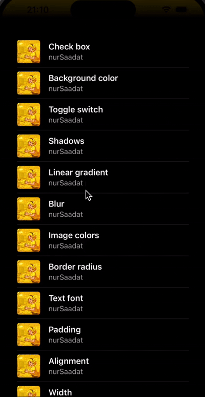
Nice job 🎉
Conclusion
In this tutorial, we've created a Spotify-inspired UI with:
- Dynamic color extraction from images
- Smooth gradient transitions
- Scroll-based animations
- A polished list interface
The result is a professional-looking music player interface that responds beautifully to user interactions.